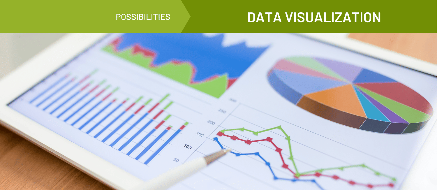
Data Visualization
Data visualization is the graphical representation of information. It involves charts, graphs, maps, and other visual tools to present data to make them easier to understand. The purpose of data visualization is to communicate information clearly and effectively to a particular audience and to make it easier to identify patterns, trends, and insights that might be missed in exploring raw data alone. Data visualization enables people to quickly grasp complex data, understand meaning and implications, make informed decisions, and communicate findings to others.
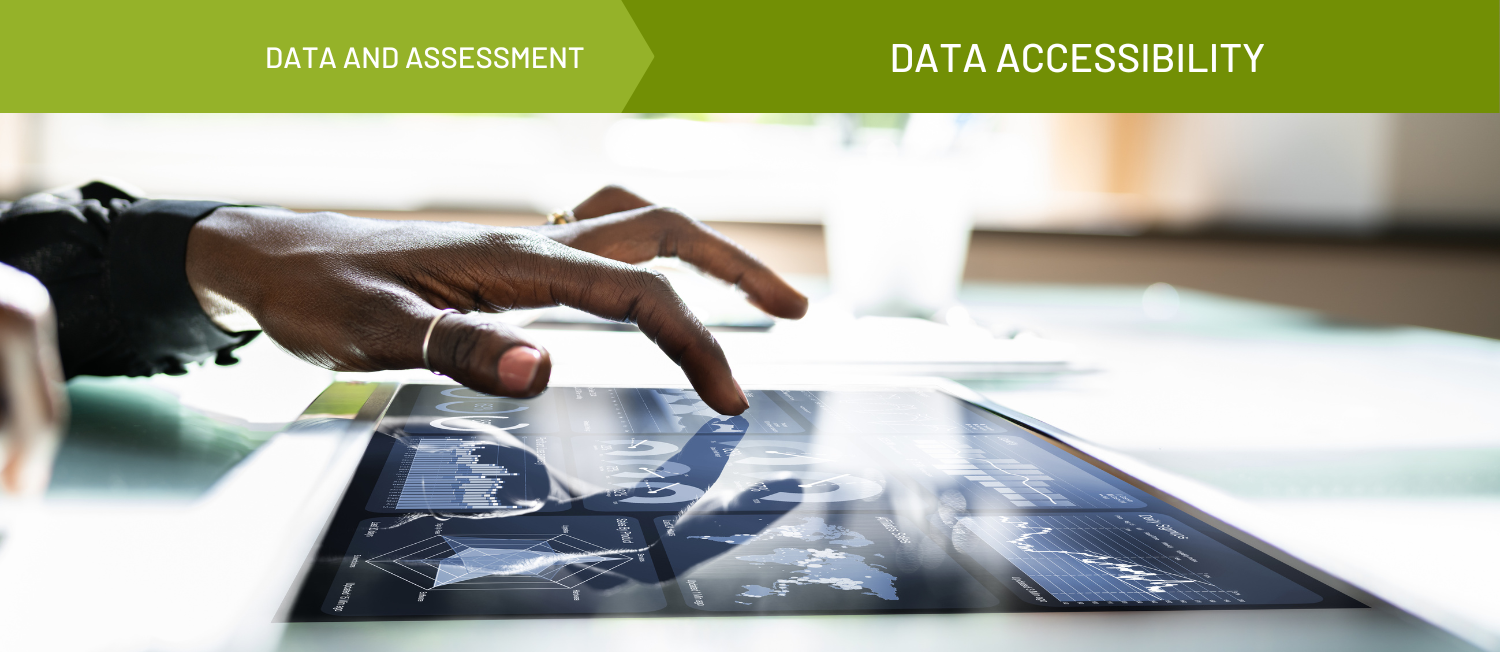
A good data visualization can make data accessible to a wide range of audiences. Visual representations of data can be better understood by people of different ages, cultures, and educational backgrounds, aiding in data sharing and stakeholder engagement.
Data visualizations can have system-level impacts by improving decision-making, increasing efficiency, improving communication, identifying and prioritizing opportunities for community investment, and increasing transparency. By using data visualizations effectively, organizations can gain insights, make better decisions, and achieve goals more effectively.
Early examples of data visualizations include Florence Nightingale's 1858 "Rose Diagram,” which was used to illustrate the mortality rates of soldiers in the Crimean War, as well as John Snow's iconic 1854 Cholera Map. John Snow created a map of cholera deaths in London, showing that the disease was concentrated around a single water pump. This visualization helped convince local officials to shut down the pump and ultimately led to vast improvements in public health and disease prevention.
More recent examples include prolific COVID-19 data dashboards—in response to the COVID-19 pandemic, many organizations and governments created dashboards and other data visualizations to track the spread of the virus and its impacts on health and society. These visualizations have helped to inform public health policy and to provide the public with up-to-date information on the pandemic.
Equity considerations are an important aspect of data visualization. Data visualizations can perpetuate bias and reinforce existing power structures if they are not designed and presented with equity in mind. Here are some considerations to keep in mind:
- Representation: Ensure that the data being visualized is representative of all groups, including marginalized communities. This means being intentional about including diverse perspectives and experiences in data collection and analysis.
- Accessibility: Data visualizations should be accessible to all users, including those with disabilities. This can be achieved by providing alt text for images, using high-contrast colors, and making sure that the visualization can be navigated using a keyboard.
- Transparency: Data visualizations should be transparent about their sources and methods. This includes disclosing any biases or limitations in the data and acknowledging any subjective decisions made in the creation of the visualization.
Data visualization can be a powerful tool in addressing health and social issues by helping to accurately and effectively identify trends, track progress, and inform policy decisions. Data visualizations can reveal insights and discoveries that might be missed in other forms of information presentation and can help users explore and discover relationships and patterns that were not immediately apparent.
An effective data visualization is one that presents complex information in a way that is easy to understand, engaging, and relevant to the audience. The visualization should:
- Be relevant to the audience and clearly communicate the insights that are most important to them.
Be accurate and presented in a way that is truthful and transparent.
Provide context for the data, helping the audience understand the larger story behind the numbers.
Be engaging and visually appealing, with clear and well-designed charts, graphs, and other visual elements.
Resources & Tools


A Scoping Review of Virtual Focus Group Methods Used in Rehabilitation Sciences
Resource - Journal Article


Exploring the Public Health Workforce Through Data Visualization
Resource - Map
Brought to you by de Beaumont Foundation Inc.


COVID-19 Maps, Graphs, & Figures
Resource - Data Bank/repository
Brought to you by National Coalition of STD Directors


More Than Numbers: A Guide Toward Diversity, Equity, and Inclusion (DEI) in Data Collection
Resource - Guide/handbook

A Guide to Conducting Online Focus Groups
Resource - Guide/handbook
Brought to you by Vital Strategies


Focus Group Tip Sheet
Resource - Fact Sheet
Brought to you by U.S. Department of Health and Human Services


Understanding and Using American Community Survey Data: What All Data Users Need to Know
Resource - Guide/handbook
Brought to you by Census Bureau

Do No Harm Guide: Applying Equity Awareness in Data Visualization
Resource - Guide/handbook
Brought to you by Urban Institute


Perils and Possibilities: Achieving Best Evidence from Focus Groups in Public Health Research
Resource - Journal Article


Using Benchmarks to Explore Population Health Data
Story
Brought to you by IP3
Published on 08/23/2022

Understanding and Interpreting Population Health Measures
Story - Written
Brought to you by IP3
Published on 11/15/2022

Foundations for Community Health Data Users
Story
-
 Original
Brought to you by Community Commons
Published on 04/17/2024


Opportunity Insights Economic Tracker: Supporting the Recovery from COVID-19
Tool - Data/mapping Tool

Related Topics